Marketing Automation Dashboards
Using marketing automation tools like Eloqua or Marketo can create a lot of data. Also, campaign execution platforms don’t always have the best reports. That’s why I’ve created some custom visualizations using Tableau Software.
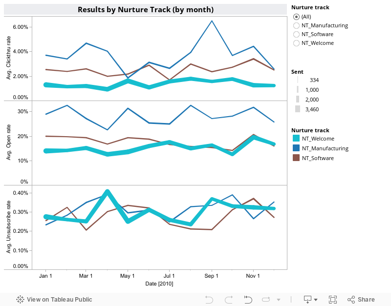
Below are four dashboards. The first shows the results of three nurture tracks over time. Tableau lets you present in more than two dimensions (color = nurture track, thickness of the line = # of emails sent, clickthru, open and unsubscribe rates are on the y-axis and time on the x-axis). Drilling down into one track is easy with the filter on the right. This report will help you spot any trends over time like list fatigue, increased unsubscribe rates or improved lift on your content.
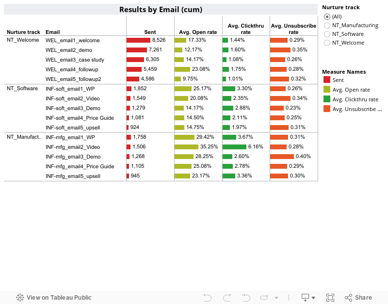
In this next example, you will see a breakdown of all emails, but cumulative per email rather than spread out over time. From this you can look at emails individually to judge those that work, those that don’t and those that drive away your prospects.
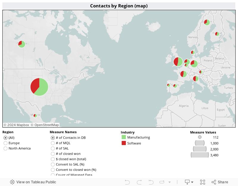
This next dashboard shows a geographic distribution of database contacts where color represents industry. But the measure of total database contacts can be changed to marketing qualified leads (MQL), sales accepted leads (SAL) or even closed-won revenue by region. With data by month, you could even add a filter by year, quarter and/or month.
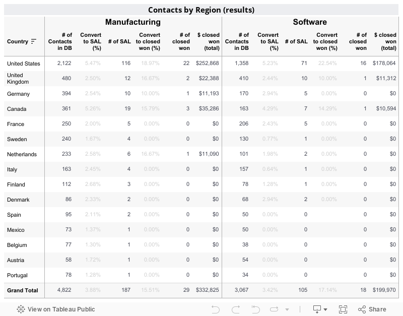
This last dashboard shows results by country with numbers. From these last two regional dashboards, you can quickly pinpoint from where your leads and revenue are coming and then drill down into the actual numbers.
Best of all, these dashboards can change to suit the business situation in which you find yourself. Stay tuned for more sample dashboards covering other marketing automation and lead management topics in the coming weeks.
If you would like to know more about how Spyglass Intelligence LLC can help you build your own custom marketing automation reports, fill out this form and we’ll give you a call.
